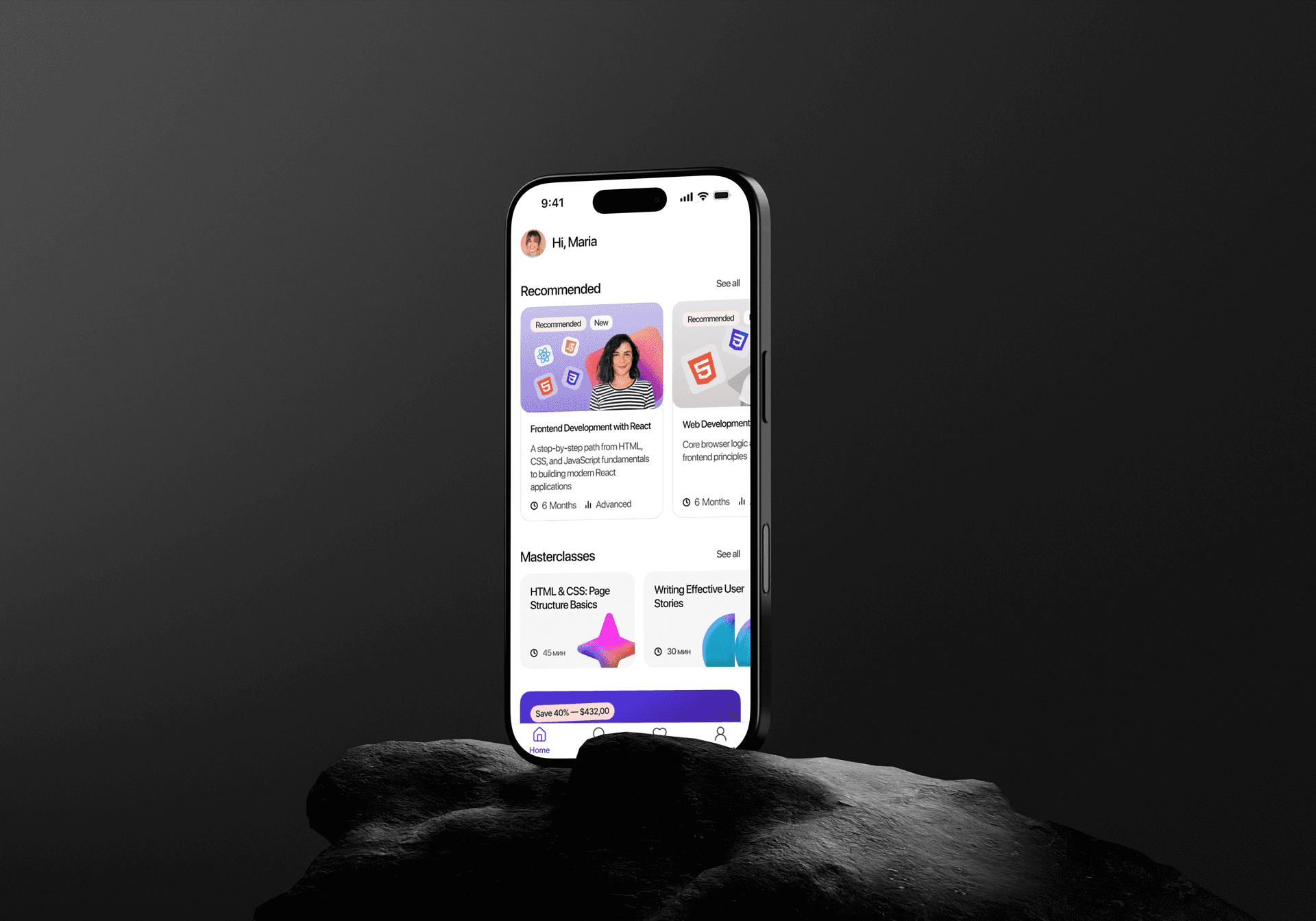

Nalu*
AI-powered consumer app (EdTech, iOS & Android)
Designed for personalized learning and AI-driven quizzes.
CLIENT
Uprock
Role
Product Designer
TIMELINE
6 Months
PLATFORM
Mobole app
TEAM
1 Product Designer,
1 Art director
// Context and Problem
Working professionals take courses but need proof they actually understood the material - not just a certificate of completion.
The core problem:
people finish lessons without knowing if the content stuck.
Goal:
Build the MVP of the whole app and design a guided path to real comprehension - an AI-quiz loop that confirms understanding instead of tracking progress - then validate it with real users before build.
Nalu was built through an AI-native product design workflow.
I used Claude throughout research, information architecture, user flows, wireframing, and high-fidelity exploration, with Claude Code and Codex supporting the transition from design decisions to a functional product. Instead of stopping at a clickable prototype, I vibe-coded the app into a working experience so I could put the actual product flow in front of users, observe where they struggled, and bring those findings back into the design. AI wasn't a final production shortcut - it was part of the research, design, prototyping, and validation loop.
Nalu's job isn't to give people more content to sit through. It's to build a guided path to real comprehension, using AI-generated quizzes that confirm understanding instead of just tracking progress.
I ran this project solo, end to end - market research, target audience and competitive analysis, a design system built from scratch with tokens, prototyping, and usability testing. From initial concept through developer handoff.

Competitive Research
competitors make the quiz mandatory to pass, with several attempts.
Nalu flips it - questions are generated fresh every time and answers are shuffled, so you can't memorize or guess; the quiz is optional for completing the lesson, so choosing it is real proof of understanding.
User Segments
To find out where the feeling of "I actually get this" was breaking down, I went and talked to people directly — not what they were studying, but why. From in-depth interviews, I built 3 personas: the Goal-Closer, the Practical Pragmatist, and the Fast Competitor. Goal-Closer. Highly sensitive to course structure and to the feeling of "I closed this topic out." She wants everything tight and structured, no filler, short blocks.
I designed more than 7 scenarios across the project.
In this case I'm walking through just one - the most critical.

Next, I moved to a User Journey Map - to pinpoint exactly where along this path the Goal-Closer might drop off.


Next, two issues opened up.
The first: the one that worried me most: what happens when someone answers wrong. The second, and after a lesson, it's unclear what comes next.
Product goal
Give users who answer incorrectly on the quiz a clear path back to the material for the specific topic they got wrong.
Research goal
Understand how users look for a way to work through a topic they missed, right there on the quiz results screen — and what path back to the material they expect to find.
To conduct the qualitative research, I defined five user profiles with different motivations, recruited people who matched those profiles, and sat them in front of the prototype. I asked them to think out loud, and that's when it got uncomfortable:
All 5 could see the correct answer — and not one of them understood why it was correct.
Retrying turned into guessing. Everyone spotted the "Try again" button, but nobody read the "Something to review" block as an action. The person was left alone with their mistake, with no idea where to go next.
That's where the idea that shaped the whole project came from: people don't need a score telling them how much they know - they need a direction.

The same logic caught up with the result metric. The test surfaced it: 4 of 5 confused "Depth of understanding" with the percentage of correct answers — one number produced four different readings.
Two metrics side by side didn't sharpen the picture, they argued with each other.
So I kept one — a clear percentage — and tucked "how it's calculated" under an icon: it doesn't weigh down people who already get it, but it opens an explanation for those who want to dig in. And I added a passing threshold — "you need at least 75%" — so the person has a clear reference point instead of an abstract score: did they close the topic, or is it worth coming back to.


While designing Nalu, we saw the quiz as an important step between taking a course and seeing the value of the subscription. We also wanted returning users to check their knowledge without reading the lesson again.
My goal was to increase conversion from the course page to starting a quiz. Before choosing a design, I needed to understand where users naturally expected to find the comprehension check. We had two possible entry points: a “Check understanding” button and a quiz item inside the lesson list. I designed a first-click test. I showed them the course page and asked them to start a comprehension check for a specific topic, without telling them where to click. 89% participants, first clicked the “Check understanding” button. Only 7% participants, selected the quiz in the lesson list.

I recommended using the “Check understanding” button as the main quiz entry point and keeping the syllabus item as a secondary path.
The research gave us a clear top-funnel design decision and reduced the risk of hiding an important subscription-related action inside the lesson list. It also created a direct path for returning users who wanted to check their knowledge without repeating the lesson.
The design system is a story of its own. There wasn't one, so I built it from scratch, and from day one for both platforms: iOS and Android.
The tokens also carried the handoff: developers got real values instead of a picture.

First-click test
89% found the intended quiz entry vs 7% for the alternative
Single-metric simplification